Elegant WordPress web design with bespoke theme
A visually appealing architects WordPress website with easy to use CMS
Impactful custom WordPress web design
The challenge
Clear Architects is renowned for its bespoke high-end architecture and exceptional successes in both planning strategy and in planning appeals. The firm specialises in harmonious architectural designs that secure planning permission in highly protected areas of natural beauty, working across residential and commercial builds on project budgets of £350,000 to £20 million.
RIBA Chartered practice, Clear, partnered with Feel Created via marketing communications agency, Luminescence to develop a solution that showcased the work of its two studios based in Epping Forest and the New Forest.
Our solutions:
- Initial consultation and project management support
- Elegant custom website design
- Streamlined user-experience
- Engaging, visually impactful animations
- User-friendly WordPress CMS
- Ongoing monthly support (as required)
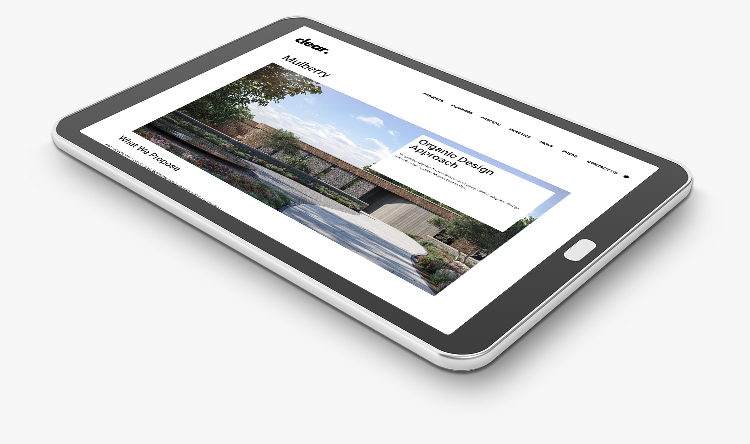
Straightforward user experience
The solution
Simplicity was a vital requirement of the brief, allowing the work of Clear to shine through. We incorporated engaging animations to lift the design to ensure that the site was not simplistic. WordPress was selected as the content management system (CMS) of choice to make future updates easy for the Clear team to carry out. We introduced block editing functionality into the new site, meaning that any updates carried out would be on-brand, retaining the clean and straightforward website aesthetic.
Engaging custom elements
Attention-grabbing features
It was essential that the visually striking imagery of Clear Architects took centre stage within the web design. A full-width carousel was introduced to maximise the firm's online real estate. Our team incorporated moving visual elements to balance simplicity with clear signposting to grab the user’s attention. For example, the full stop on the Clear brand name was set up to 'roll' across the page from left to right, revealing the navigation bar.
Lazy loading-style functionality was incorporated on each page, loading content as the user scrolled down the page. This type of loading gives the user a sense of the site being personalised, responding to their actions rather than appearing static. The technique helps to create a greater sense of intimacy with the site for the average user. Other interactive elements added to the build are a testimonial slider feature and a ‘find out more’ carousel.
Mobile-first functionality
Designed for the modern customer
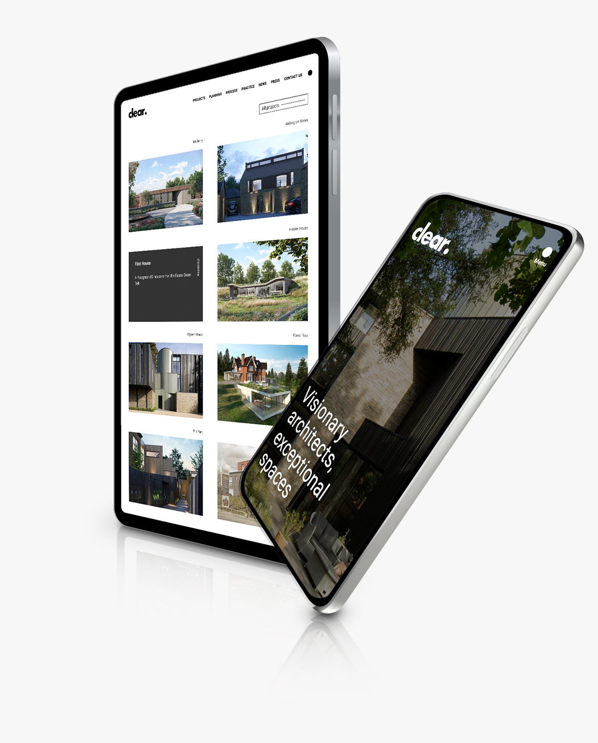
The Clear website was designed to look just as good for those on the move as for those sitting at their desks, with imagery central to the mobile format. Responsive design was factored into the development, ensuring that the site ranks effectively and is not penalised by Google. Moving elements were still a part of the design but were adjusted to suit a mobile format. For example, the 'rolling' full stop one within the desktop design became an expanding logo element in the mobile version.

We select only the best to work on our clients’ web projects. The team at Feel Created are a ‘safe pair of hands’ for all web projects. Highly skilled, responsive, professional and a delight to work with – we highly recommend them.
Anna Lawlor, Co-Founder, Luminescence CommunicationsUser-friendly WordPress CMS
Future-proofed content updates
WordPress was selected as the CMS for the Clear Architects project because it is a familiar, easy-to-use system for future content updates. The system has been designed with block editing functionality, meaning that the Clear team can create new pages and/or update content within the boundaries of set design elements that retain the Clear look and feel. Regular content updates are beneficial for search engine optimisation. So, empowering the Clear team to make regular updates adds far more value than returning to Luminescence and ourselves to update site content (although this can be factored in as a cost-effective option if required). Regular site maintenance is recommended to ensure that updates keep the site as secure and high-functioning as possible.
Tailored user experience
Custom post types and features
We introduced custom post types to help speed up the content update process to eliminate unnecessary person-hours for the Clear team. Custom post types included team posts, case study listings, testimonials, ‘featured in’ and accreditations. Custom post types allowed the Clear team to quickly select and update the required template rather than create a post from scratch. In addition, features such as MailChimp integration facilitated a seamless transition for the Clear team with no downtime on data distribution and collection.
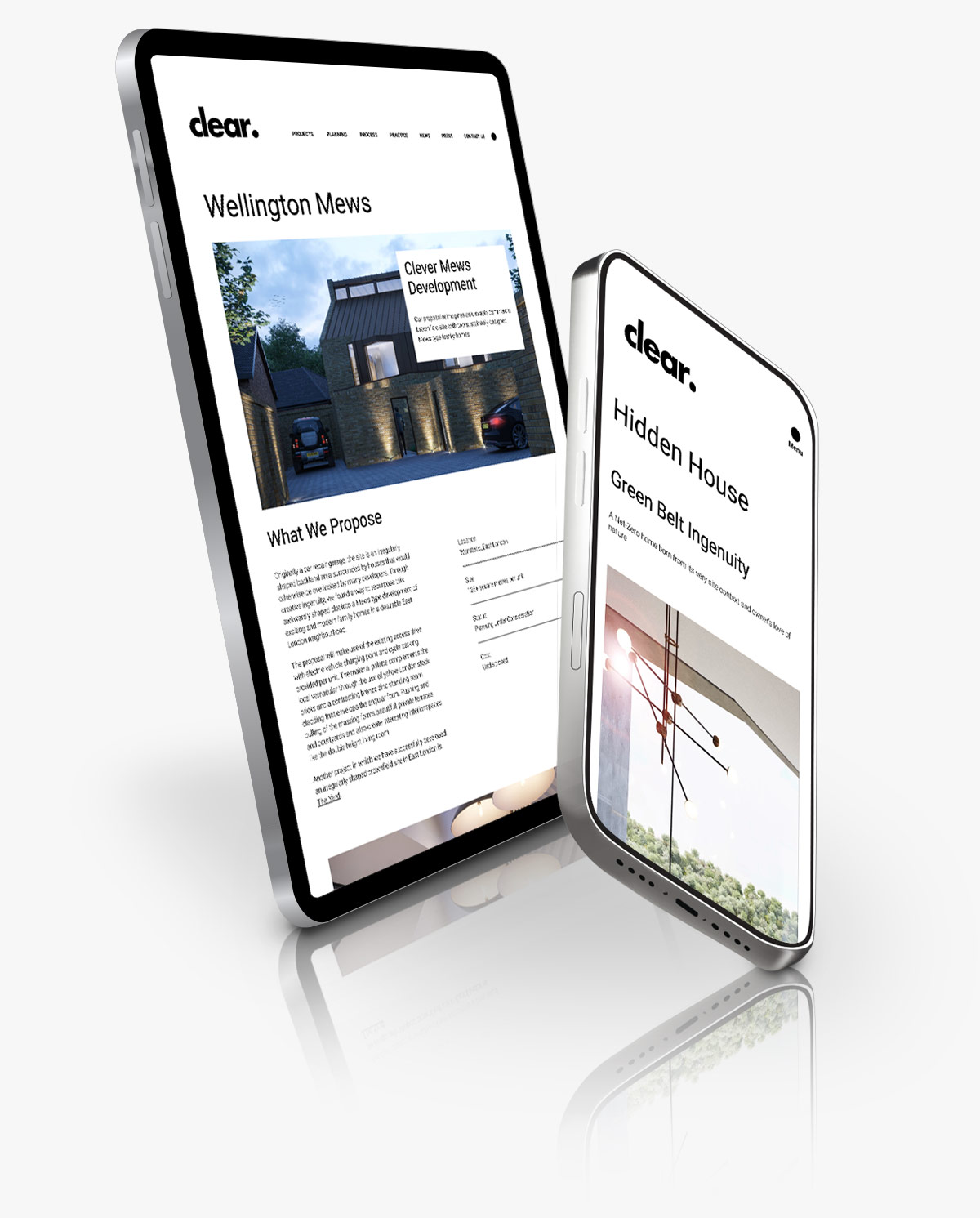
A custom, impactful WordPress CMS
The result
Our team met Clear Architects' brief for a visually impactful, simple to use site that showcased the firm's work. In addition, we added engaging moving elements to lift the design and catch the eye of users. We based the solution around WordPress CMS to make future updates simple to make sure that the Clear team gained ongoing value from the site. The popular CMS system is familiar to most users and, due to our custom theme, supports users in making content updates that are on-brand without affecting the site’s look. Clear Architects was delighted with the results, which they continue to update regularly.
