University of Liverpool Prosper portal

An enterprise-level WordPress design for higher education

Unlocking postdoc career potential with an innovative online platform

University of Liverpool Prosper portal

A web design to help unlock postdoc career potential

The challenge

The University of Liverpool (UoL) is one of the UK's leading research-intensive higher education institutions. UoL is a Russell Group member and consistently ranks in the top 200 universities worldwide.

Recognising the national need for better career development support for UK postdocs, the UoL's Development Academy – in partnership with the University of Manchester and Lancaster University, and with funding from Research England – launched Prosper in 2019. Over the course of two pilot cohorts, Prosper developed an innovative and holistic career development offering for postdocs inspiring them to reflect, explore and act confidently when considering their next career move.

As part of the pilot and development phase, Prosper developed a prototype online ‘Prosper Portal’, where members of its pilot cohorts could access and revisit all of the resources on offer. The WordPress-based Prosper prototype gave postdocs access to expert digital resources (inc. various media types), supporting their ability to thrive in multiple career pathways.

The ultimate aim of the project following its pilot cohorts was to launch its offering to the wider UK Higher Education sector. Prosper recognised that this required specialist development of a new version of the Prosper Portal, transitioning from a relatively simple prototype to a more sophisticated and technically advanced solution. Prosper chose us (Feel Created) to fully develop the solution for national rollout.
Gallery Image

An advanced WordPress CMS design for higher education

The solution 

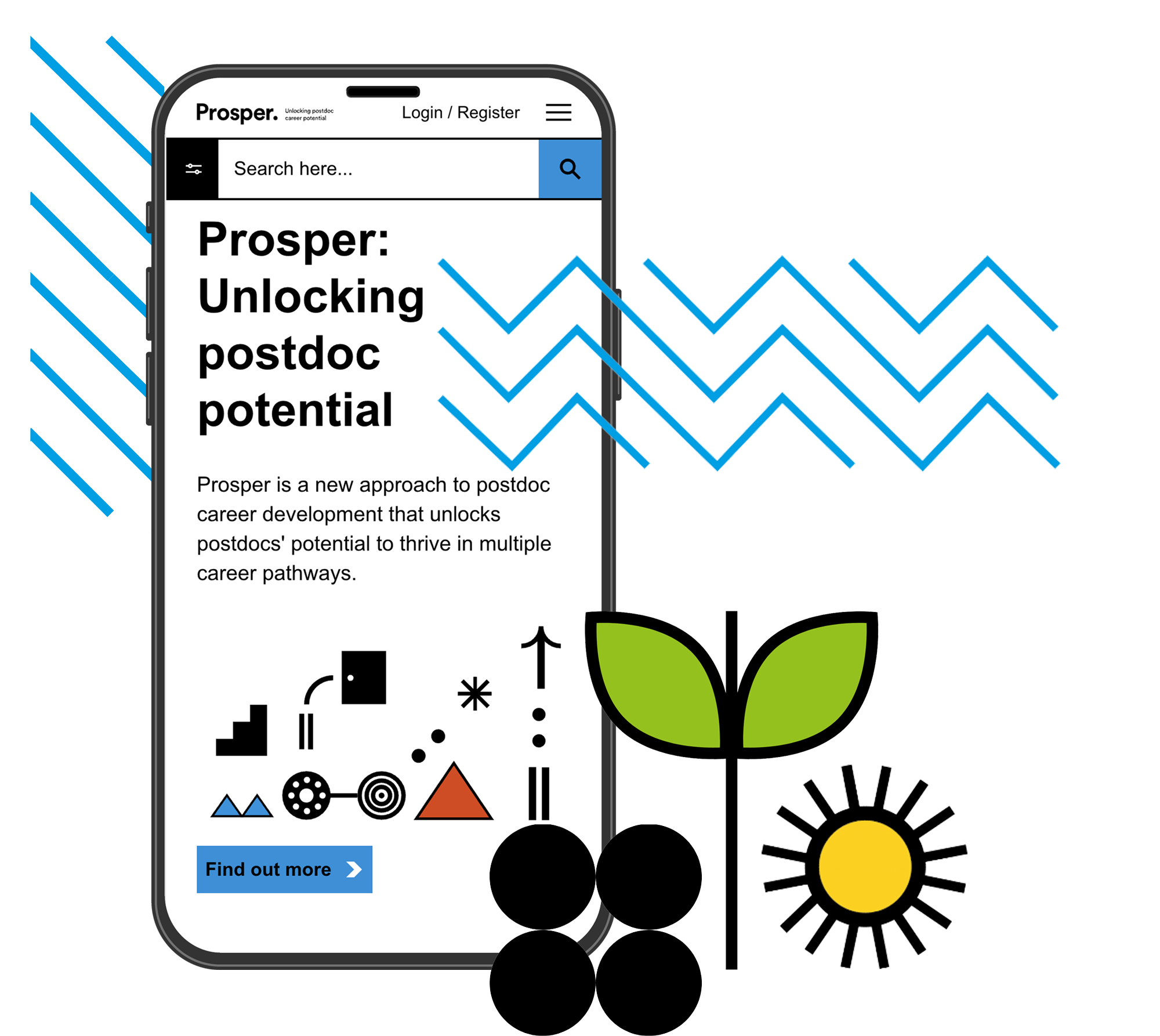
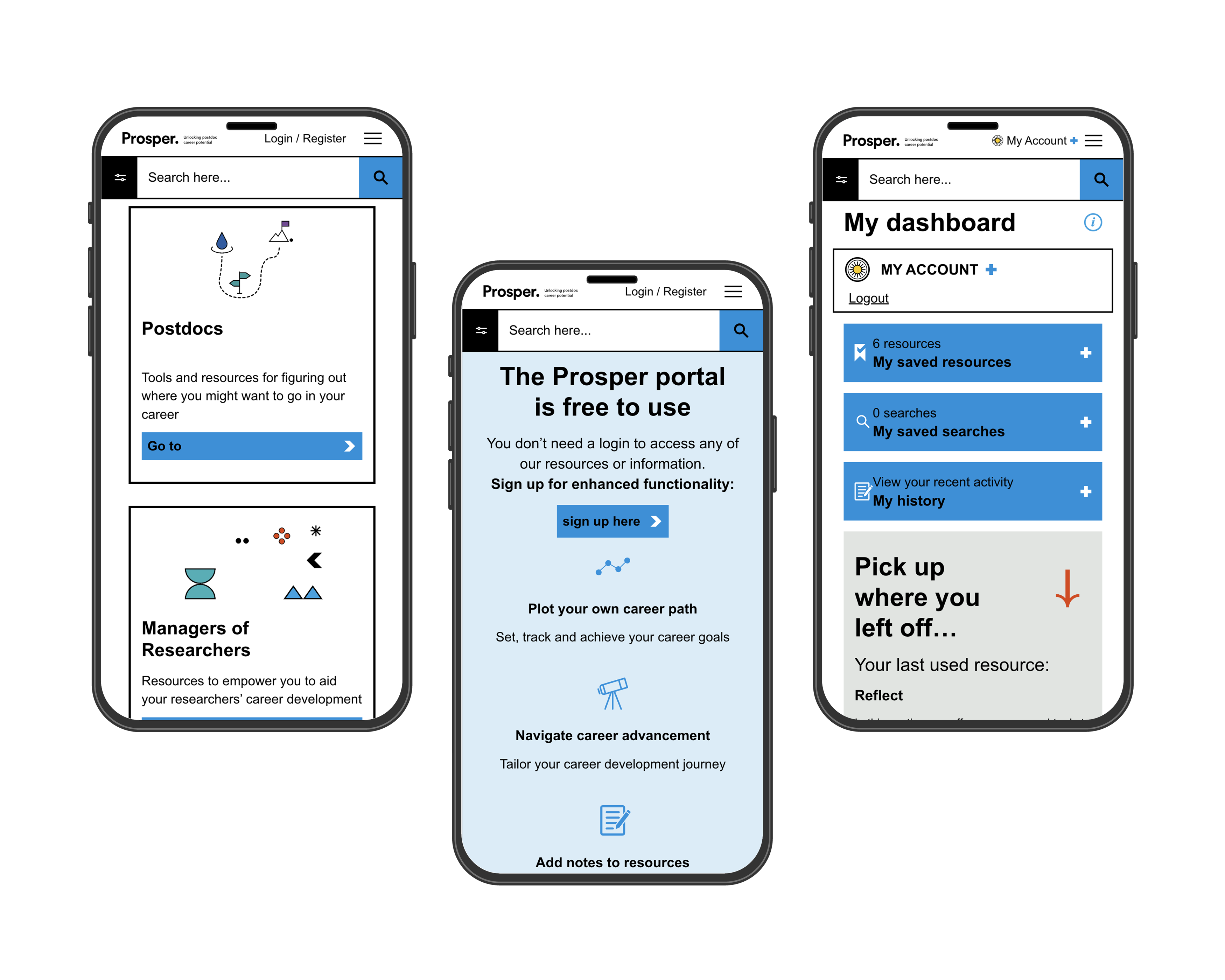
The core aim of the Prosper online portal was to direct postdocs, and those supporting them, to relevant career resources. Easily filterable results and the ability to bookmark information were essential to the platform's success, which called for advanced functionality in the build. An interesting design element was the omission of photographic imagery (of any kind) to ensure Prosper was inclusive to all.

We were asked to incorporate graphic icons instead – for visual appeal and to aid with signposting. We worked closely with the Prosper team to understand user needs, carrying out user testing workshops as part of the planning and development phase to ensure we delivered a system that was readily accepted by end-users.

An advanced WordPress CMS design for higher education

Creating the best possible user experience

Setting the Prosper style and tone

The Prosper team had already been through a period of co-creation, testing and refining, working with pilot cohorts to understand user needs. This knowledge and a robust discovery phase set the scene for the site's look, feel, and tone. The Prosper team found the portal affected the confidence, perceptions, aspirations and behaviours of the first cohort as a whole - and wanted to ensure this momentum was carried through into the final user experience. 

We created a design that let the Prosper graphic iconography (commissioned separately) shine, creating simple yet impactful Lottie animations for the homepage to encourage engagement. Strategic colour use and signposting were critical to directing users effectively within the site, which does not rely on lifestyle imagery to connect users with the Prosper brand. We also worked with the Prosper team on persona and scenario development, ensuring we understood the different user types that would typically use the system and how to direct them efficiently. The results of this work went on to be valuable in the testing period, informing testing scenarios.

Enhancing WordPress search functionality 

Creating a flat search database

WordPress search is notoriously basic, and we needed to introduce something more advanced for this project. So, we generated a flat 'database' of information by evaluating the individual resources/page content and pulling out key information (such as often-used keywords within a page). The flat database made searching faster and more targeted and could be used with WordPress search to improve relevance scores and filtering. This enhanced search functionality allowed users to find what they need quickly and easily, saving time that might otherwise be spent manually evaluating and bookmarking or discarding results.

Managing user expectations

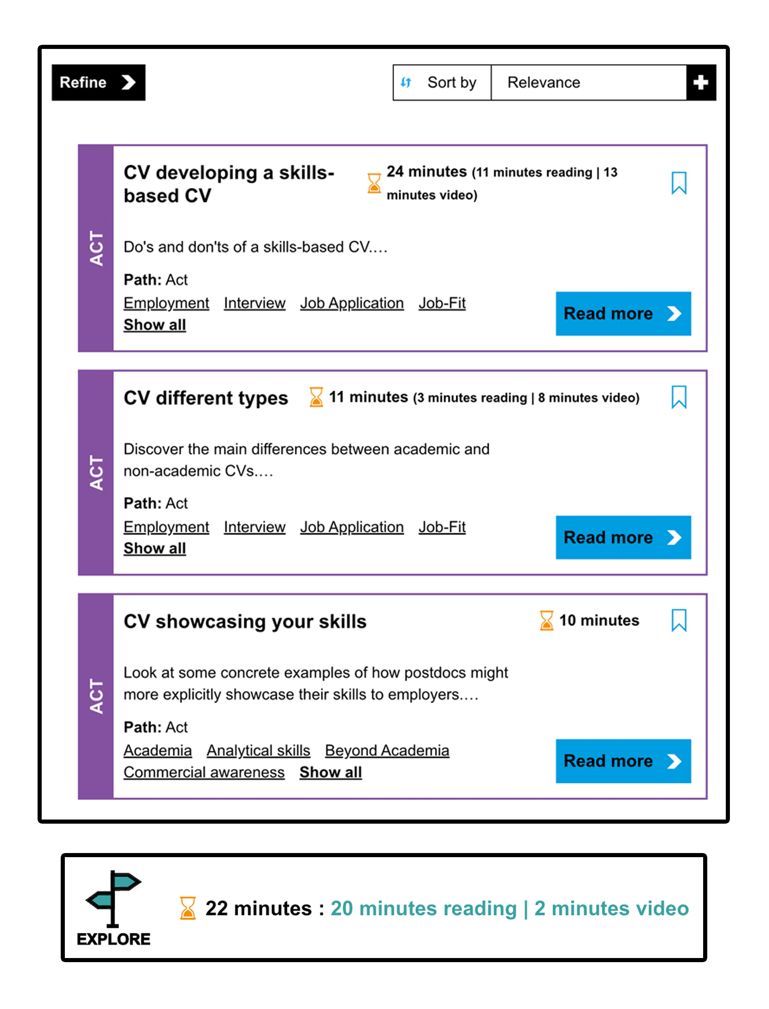
Introducing estimated read times

A sub-benefit of the flat search database was that we could create estimated reading times based on the amount of on-page content (for written content). Administrators could also enter the length of video resources and activities. It had been identified that postdocs, and supporting staff, would appreciate an indication of how long they would need to spend on a resource, allowing them to build an overall resource journey that suited their timescales. Introducing accurate read times met this need.

Managing user expectations

Building in registered user benefits

Enhancing the user experience

The Prosper system is freely accessible to use and free of charge. There is no requirement to register. However, a sign-in feature was created to enhance the user experience, allowing registered users to bookmark resources and track progress. These are some of the benefits that apply to registered users... 

Registered user benefits:

  • Different User Types
    Users could choose their user type (postdoc, line manager or institute lead) based on their current role in academia (and beyond), offering targeted functionality and additional access.
  • Engagement Notifications
    Logged-in users could receive additional engagement notifications, such as updates or digests of their recent activity and the next steps they could take. These notifications benefit the expected drop-off rate from initial engagement to entice users to return to the system and continue their journey.
  • Note taking
    Registered and logged-in users could add notes to resources, providing an additional layer of immersion with the content and aiding reflection and forward planning. Notes could be added to specific blocks of content or an entire resource.
  • User Interactions
    A series of specific user interactions gave a novel way to capture information, introducing self-reflection as part of the user’s Prosper journey.
  • Resource Sharing
    Specific user types could share their own resources, case studies and events, building a community aspect to the system that lives beyond the initial content created directly by Prosper. Prosper administrators could co-opt shared resources, making them part of the core resource offering (whilst still giving credit to the original publisher).
  • User History
    The system was designed to track the activity of logged-in users so they always have access to a complete digest of the resources they have accessed. This access included actions taken (such as bookmarking a resource or adding notes) and helped users jump back in after a period of inactivity or re-evaluate their journey.
Gallery Image
An enterprise WordPress design for education

The result

Our collaboration with the Prosper team has resulted in a Prosper portal that's ready to launch to postdocs nationwide, complete with the technically advanced functionality the team initially envisaged (and more we've uncovered and developed along the way!). Pro-Vice-Chancellor for Research and Impact at the University of Liverpool, Anthony Hollander, has described how he's 'seen first-hand the impact Prosper has had on postdocs involved in the pilots'. He expects Prosper to be the gold standard for the sector, helping to drive best practice in this area of research culture. We are now contracted to provide hosting and maintenance for Prosper, and we can’t wait to see how it develops.

Gallery Image
Let's start a project Let's start a project
Latest
Arrow left Arrow right
WCAG 2.2: A Beginner's Guide to Web Accessibility
Blog Article WCAG 2.2: A Beginner's Guide to Web Accessibility
Read more: WCAG 2.2: A Beginner's Guide to Web Accessibility
Project Longitude, WordPress CMS build
Longitude, WordPress CMS build
Read more: Longitude, WordPress CMS build
What We Do Website & System development
Read more: Website & System development
What We Do Custom WordPress design & development
Read more: Custom WordPress design & development
The best social media platforms for business: How to choose the right ones for you
Blog Article The best social media platforms for business: How to choose the right ones for you
Read more: The best social media platforms for business: How to choose the right ones for you
Blog Article How to choose the right WordPress agency for your website build
How to choose the right WordPress agency for your website build
Read more: How to choose the right WordPress agency for your website build
Feel Created To Join Dragon Boat Race for Children's Hospice
Latest News Feel Created To Join Dragon Boat Race for Children's Hospice
Read more: Feel Created To Join Dragon Boat Race for Children's Hospice
What We Do Digital tool planner sessions
Read more: Digital tool planner sessions
Feel Created secures placement on G-Cloud 14 framework
Latest News Feel Created secures placement on G-Cloud 14 framework
Read more: Feel Created secures placement on G-Cloud 14 framework
Blog Article Website redesign or refresh: Is it time for a spring clean?
Website redesign or refresh: Is it time for a spring clean?
Read more: Website redesign or refresh: Is it time for a spring clean?
Blackpool Sixth Form College Launches New Website by Feel Created
Latest News Blackpool Sixth Form College Launches New Website by Feel Created
Read more: Blackpool Sixth Form College Launches New Website by Feel Created
Project Nicholas Associates
Nicholas Associates
Read more: Nicholas Associates
Venn
Project Venn
Read more: Venn
Project Learning English
Learning English
Read more: Learning English
What We Do Web design
Read more: Web design
Blog Article Writing a strong website brief: A step-by-step guide
Writing a strong website brief: A step-by-step guide
Read more: Writing a strong website brief: A step-by-step guide
Feel Created Joins the Ranks of Verified Green Hosting Providers
Latest News Feel Created Joins the Ranks of Verified Green Hosting Providers
Read more: Feel Created Joins the Ranks of Verified Green Hosting Providers
What We Do Hosting and Maintenance
Read more: Hosting and Maintenance
Thinc
Project Thinc
Read more: Thinc
Latest News Feel Created Partners with Stanmore College to Create New WordPress Website
Feel Created Partners with Stanmore College to Create New WordPress Website
Read more: Feel Created Partners with Stanmore College to Create New WordPress Website